Composite Index Of Leading Indicators: History Shows That They Often Mislead With False Signals
- Joe Carson

- Jun 19, 2023
- 4 min read
A research paper by the staff at the Federal Reserve Bank of Dallas (1993) claims that the composite index of leading economic indicators does not provide "reliable advance information on the direction of the economy." Other studies have found that nearly half of the cyclical peak predictions in composite indexes of leading indicators were false signals.
The key takeaway from these studies, and others, is that the forecasting record of the composite index of cyclical indicators is not 100% accurate because the group of leading indicators that accurately predicted one cycle might not work in the next. In other words, as the economy moves from one business cycle to the next, the economy changes, as does the policy structure, and some indicators become obsolete and less reliable while others gain more predictive power.
Forty percent of the economic series that comprised the leading index in the 1980s and 1990s, when the Dallas Fed paper was researched, are no longer included. Change is a recurring feature of the leading economic indicators. In the 2000s, a new way of measuring the Treasury yield curve became part of the index. After the financial crisis of 2007-09, the redesigned leading economic index included a leading credit series and the ISM new orders series, removing broad money and vendor performance.
It's too early to conclude confidently that the current composite index of leading indicators sends accurate or false signals. But the performance of several indicators needs to be examined to avoid a wrong prediction.
For example, the current leading indicators index includes three new manufacturing order series. That construction is not ideal as it is best to have indicators covering a wide range of activities and sectors to avoid the intercorrelation between economic indicators.
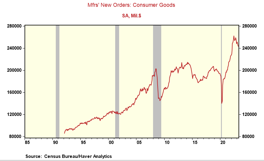
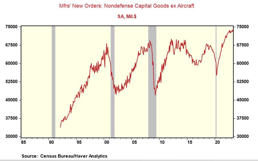
Also, the current economic cycle has had unique features for the goods sector. Once the economy re-opened following the closures of businesses during the pandemic, there was a record surge in demand, especially for goods, driven by pent-up demand and unprecedented fiscal and monetary stimulus. Yet, firms could only respond slowly due to part shortages and supply chain bottlenecks. That forced firms to double and even triple ordering, resulting in the most significant (record) gains for manufactured consumer goods and capital goods (excluding aircraft). Now that the "ordering binge" has ended, the new orders series have reversed, especially for consumer goods posting monthly declines in five out of the past six months. That has contributed to the leading index's monthly decreases.
Yet, is removing "double-ordering" a sign of economic weakness or a technical adjustment in the orders series? New orders for consumer goods are off their record highs but remain elevated and stand 25% above pre-pandemic levels. Meanwhile, new orders for capital goods (ex-aircraft) were at record highs in April. It's worth noting that unfilled orders, an indicator in an earlier version of the composite index of leading indicators, stands at a record high. New and unfilled orders raise questions about whether the economy is transitioning to a slower growth environment or an outright recession.
Another questionable component of the current leading index is the yield curve, or the spread between the yield on the 10-year Treasury and the federal funds rate. The yield curve series was included in the leading index in the mid-2000s. But that was before the Fed embarked on quantitative easing (QE) or the purchase of long-date securities with the primary intent of keeping long bond yields lower than what otherwise would be the case.
The current inversion of the yield curve is the widest on record, negatively impacting the composite index of leading indicators. It defies logic to think that the yield curve offers similar (leading) signals when the Fed buys securities and when the Fed does not. The Fed doubled its balance sheet to over $ 8 trillion during the past three years. The yield curve was added to the composite leading index in the mid-2000s, and the Fed balance was pretty steady at $750 billion, less than one-tenth of its current size.
With QE as a new policy tool, comparing long bond yields to inflation makes more sense as it is a proxy for real interest rates and captures the intent of QE (i.e., keeping the long-term borrowing cost low). Replacing the yield curve with a proxy for real interest rates would dramatically alter the pattern of the composite of leading indicators.
One cannot use Paul Samuleson's comparison of the stock market in predicting "nine out of the past five recessions" with the track record of the composite index of leading indicators because if the current composition of the index does not accurately predict business cyclical turning points, it will be refitted or redesigned with a group of indicators that does. Unfortunately, that does not offer any hope for investors because people make decisions in "real-time" and can't wait for data revisions or a new index. History painfully shows that using one set of cyclical indicators to predict the future is fraught with failure. That's not a criticism of using leading indicators to help predict cyclical turning points. Still, things are constantly changing in the economy, requiring more than a small set of indicators to predict the future.


Comments